Milwaukee Brewers roll out new logo – and a Mississippi man created it
Published 6:51 pm Tuesday, November 19, 2019
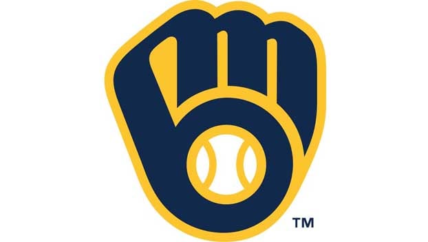
The Brewers are bringing back the team’s iconic ball-in-glove logo next year and the revised logo has Mississippi fingerprints all over it.
Milwaukee unveiled its new uniform designs and logo on Monday night at Miller Park. Starting in 2020, players will wear a modernized version of the ball-in-glove image first introduced in 1978 and worn until 1993.
A 50th anniversary sleeve patch will commemorate the team’s half-century in Milwaukee after launching as the Seattle Pilots in 1969 and then moving.
The new look was formulated with RARE Design in Hattiesburg, Mississippi.
The work to redo the team’s logo began in several years ago Brewers owner Mark Attanasio said.
“We started this in 2016 and it’s been a work in progress,” Attanasio said. “Hopefully next year we have a championship team, a great new logo, and 50 years to celebrate.”
The ball-in-glove is back — with some measured changes.
The Brewers interviewed a number of brand specialists before intentionally hiring one — Mississippi-based Rodney Richardson of RARE Design — who had no ties to the Brewers or Wisconsin, and had never rebranded an MLB team. Most of his high-profile experience is in the NBA, where Richardson has done work for the Minnesota Timberwolves, Charlotte Hornets and Sacramento Kings. Notably, Richardson did not come to the initial meeting with any design ideas. That’s one of the reasons the Brewers chose him, Schlesinger said. It was a blank canvas.
Within the first 6-8 months of the process, Richardson presented a variety of possibilities, including sketches of some radically different looks.
“Going into this process, the Brewers didn’t put any pressure on us to go one way or the other,” Richardson said. “They said, ‘We’re going to go through this process and discover the things we need to discover.’ The reality is that anyone who is any kind of sports fan whatsoever, you’re familiar with the ball-in-glove icon, how tremendous it is and how beloved it is.”
Richardson vaguely remembers his own “aha” moment as a boy when he saw the “M” and “B.”
“That just blew my mind,” he said. “That’s always been a really good example of a clever design, a design that can help tell stories that people don’t initially expect, and tell stories that are uniquely relevant to this club and this place and being special only in that place. That’s where some of the most meaningful components of an identity come from.”
So, the question was not whether the ball-in-glove belonged. It was a question of where it fit. And, after a consensus developed about going for a total overhaul of the logo, uniforms, colors and branding of the team — all based around the ball-in-glove – a new question arose.
How far would they push the redesign?
“We weren’t at all fearful to explore how far can we push it and still represent all the things that this identity still needs to represent,” Richardson said. “It got ‘out there.’ But I think intuitively we knew, and the organization knew, like, ‘That’s not it. That goes too far. We’ve got to respect the character of this mark.’
“But then, there are small updates to it that help the team tell stories that are near and dear to them. Like connecting the ‘M’ and the ‘B’ in the glove itself. That small thing from a design standpoint may not seem like that big of a deal, but what that tells from the team perspective is they see that bond between this city and this game.”
When Richardson presented the final product to a group of club officials, including Attanasio and his wife Debbie, and sons, Dan and Mike, Schlesinger remembers the response being universally positive.
From staff and AP wire reports


